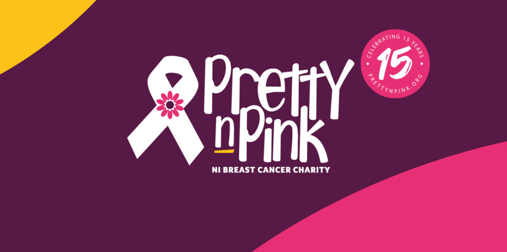
Celebrating 15 Years
Pretty ‘N’ Pink breast cancer charity re-brands as it celebrates 15 years
Pretty ‘n’ Pink has undertaken a re-brand exercise as it celebrates 15 years of supporting local patients and their families.
Pretty ‘n’ Pink re-branded in a joint collaboration with Love PR and Type Creative as the charity looked to tell its own story and better express the services it offers.
Pretty ‘n’ Pink’s re-brand is designed to forge a stronger connection with its roots by celebrating both the history of the organisation and giving the new identity a modern cultural feel. After 15 years the charity wanted to offer deepening engagement with existing, loyal audiences, and recruit new, multi-generational, supporters.
The charity was founded in 2006 by Noleen (Rooney) Adair who was herself a breast cancer patient who sadly passed away in 2014.
Myles McCann of Type Creative said, “Throughout the process, we focused on capturing the essence of Pretty ‘n’ Pink by using a unique typeface, a strong but gentle colour palette and a subtle nod to the original identity. The brand has been refined, simplified and modernised to signify a new direction for the charity and celebrate 15 years in business. Pretty ‘n’ Pink is a concept that celebrates the coming together of people while further enhancing the great work it provides to patients”.
Chris Love of Love PR said, “There is a huge emotional connection with the charity. It was important to keep recognisable elements of the charity including its colour palette of pink and purple and keeping its flower symbol and the iconic ribbon associated globally with breast cancer”.
The charity also imagined a new brand purpose statement that is simple and powerful; ‘we help, we support, we care, we’re family’.
Leanne Rooney of Pretty ‘n’ Pink and sister of the charity’s founder said, “There’s now a buoyant and optimistic sense of joy within our new brand. Our creative partner has given the charity a brand that aims to be there for everyone with a strong typeface, a bold and bright colour.